Congratulations to the winners of Bucky’s Data Viz Challenge—Barnabas Valko (student) and Andrew Hahn (faculty/staff). Barnabas and Andrew represented UW—Madison at the BTAA’s Viz Championship, held in conjunction with Love Data Week.
For Bucky’s Data Viz Challenge and the BTAA Data Viz Championship, faculty and staff can submit an existing visualization. Students must use a provided dataset to produce a data visualization for submission. In 2026, the student dataset was college fight songs.
The 2027 student dataset will be announced in the spring of 2026.
2026 Bucky's Data Viz Challenge winners
Winning student entry
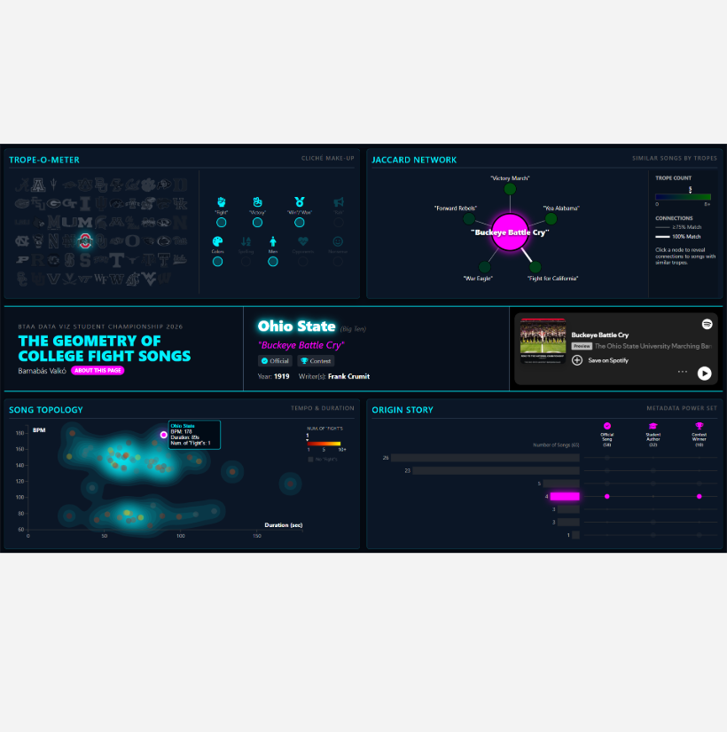
The Geometry of College Fight Songs
Submitted by Barnabas Valko.
Description: The dashboard contains four distinct data visualizations. The Trope-O-Meter quantifies lyrical clichés. The Jaccard Network connects songs by similar tropes—Song Topology plots tempo (BPM) against duration. Origin Story shows how songs were created. Clicking a logo analyzes that school’s fight song, activating a central info panel that displays the title, author, and origin, and includes an embedded Spotify player for the song.
Winning faculty/staff entry
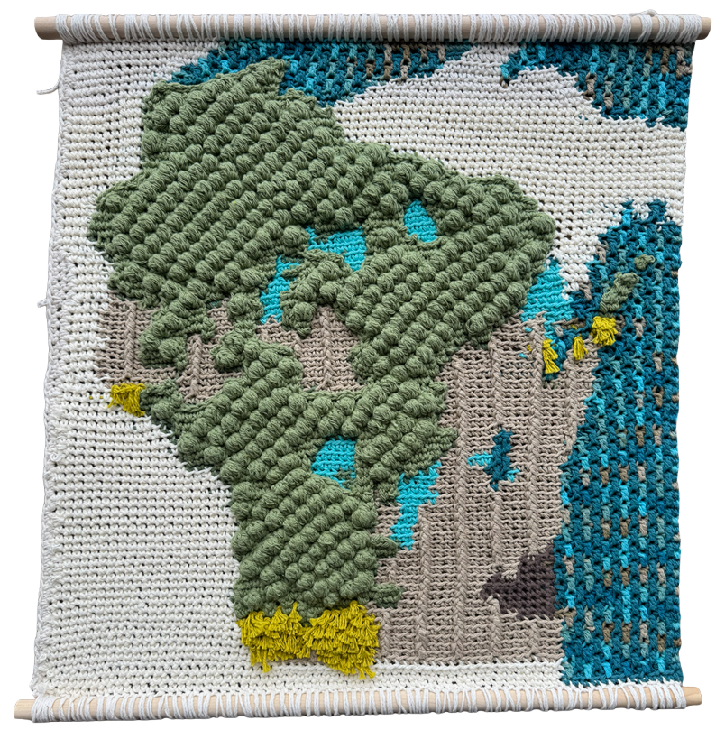
A Crochet Land Cover Map of Wisconsin
Submitted by Andrew Hahn.
Description: If you were a giant with hands the size of Wisconsin, what would our home state feel like to touch? Could you feel the bumpy tree canopies of the northwoods and the soft, stringy grasses in the driftless? Would you be able to follow our straight rows of corn and soy, and graze the cool, flat lakes and wetlands carved into the earth by glaciers thousands of years ago? This map is an experiment in texture and generalization, and it uses a unique mix of physical and digital techniques to transform a highly detailed landcover dataset into a physical surface intended to be read as much with your hands as your eyes.
2026 Student entries
Do New Big Ten Fight Songs Fit the Old Big Ten Tradition?
Submitted by Maya Anderson and Amelia Harper.
Description: We analyzed the fight songs of college football teams to determine whether the new Big Ten members (Oregon, UCLA, USC, Washington) match the traditional tempo of the old Big Ten schools. Using average beats per minute (BPM), visualizations, linear regression, and t-tests, we assess which new schools fit the conference’s historical fight song style.
The Lyrical Monolith: Decoding the DNA of Power Five Fight Songs
Submitted by Ananya Datta.
Description: Is college spirit a regional formula or a universal blueprint? This project explores the “Lyrical DNA” of 65 programs. By transforming qualitative tropes like aggression and spirit into quantitative indices, a comparative analysis across the Power Five conferences was performed. Users can drill down into “School DNA” via interactive charts and a Spotify integration. While schools are unique, the conference identities are a highly standardized blueprint of sports culture.
The Rhythm of Rivalry: A Visual Story of College Fight Songs
Submitted by Eugenie Huang.
Description: The Rhythm of Rivalry is an interactive data visualization project that explores the musical, lyrical, and geographic patterns of U.S. college fight songs. This project treats fight songs as cultural artifacts and asks how their tempo, structure, lyrics, authorship, and geography reflect shared traditions and local identities across universities, revealing both common conventions and meaningful variation among fight songs.
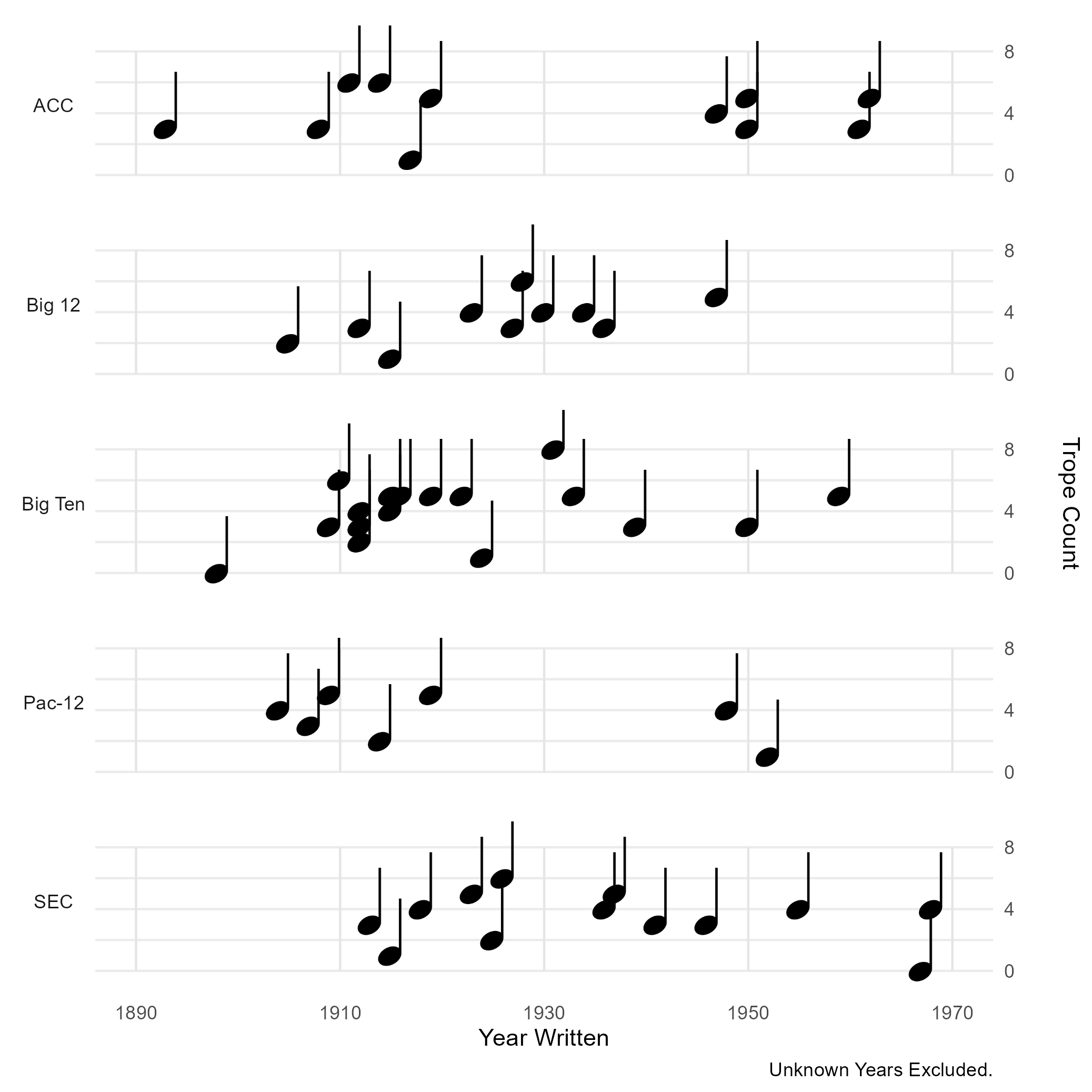
Submitted by Cameron Jones.
Description: Invoking the musical nature of the data, this dataset imitates sheet music to project the “song” of each conference over time. Each note represents an individual school’s fight song, with its left-right position indicating the year it was written, and its vertical position indicating the number of tropes it contains.
Submitted by Soham Kolhe.
Description: This project analyzes 65 college fight songs to find patterns in lyrics, tempo, and origins. The analysis uncovered several interesting findings. Slower songs tend to repeat “fight” more often, and most of the oldest fight songs still played were written by students rather than hired composers. Each section focuses on one finding, with charts that respond when you hover over them to show more details.
Submitted by Viechesta Layritz.
Description: A visualization for the fight song data.
College Football Fight Song Data
Submitted by Brett Maddry.
Description: For my dashboard, I wanted to explore informational facts about the elements that make up a fight song, for each of the original Power Five Conferences. The right-hand side can be filtered by conference as well. For example, if you wanted to see what the scatterplot and scorecards looked like for just the Big 10 or ACC, you could filter to do so.
Big Ten Fight Songs: Musical Fingerprint
Submitted by Laura Montoya.
Description: The Big Ten Musical Fingerprint compares the unique characteristics of 18 Big Ten fight songs. The story is about quantifying the blend of lyrical aggression and musical pace. To read the diagram, look at the shape formed by a song’s line (its “fingerprint”). A point extending toward the outer edge (1.0) on a given axis means that the song scores highest in that metric.
Lyrical DNA: Chord Diagram for Trope Co-occurrence
Submitted by Laura Montoya.
Description: This visualization explores the lyrical DNA of college fight songs by examining the co-occurrence of nine common lyrical tropes (e.g., ‘fight’, ‘victory’, ‘colors’, ‘rah’, ‘nonsense’). The visualization is built on a co-occurrence matrix that tallies how many songs feature any given pair of tropes simultaneously. It reveals which terms are most strongly associated with one another.
Fight Song 3D Signature for Aggression, Pace, and Complexity
Submitted by Laura Montoya.
Description: The Songs 3D Signature Plot visualizes the unique musical and lyrical identity of college fight songs across five major conferences, providing an Aggression-Pace-Complexity signature for each institution. The story behind this visualization is to see if conference membership dictates a measurable style of fight song.
Fight Song Journeys – A Sankey Visualization
Submitted by Laura Montoya.
Description: The diagram tells a story about the standardization of fight songs, showing that most songs, regardless of whether a student wrote them, gained official status by bypassing a formal contest. The width of the flow ribbons makes these dominant paths immediately apparent. The vertical columns represent the three stages (‘Student Writer’, ‘Contest Chosen’, ‘Official Song’).
Inside College Fight Songs: Tropes Across Time and Tradition
Submitted by Kayvan Sinha.
Description: The language of fight songs is explored by breaking them into common lyrical tropes such as fight, victory, chants, colors, and nonsense. How these tropes appear across four perspectives: decade, athletic conference, student authorship, and whether a song is officially recognized, is shown. One clear pattern is the strong, persistent presence of fight and victory language across all views, suggesting these themes are central to the purpose of a fight song.
Winner! The Geometry of College Fight Songs
Submitted by Barnabas Valko.
Description: The dashboard contains four distinct data visualizations. The Trope-O-Meter quantifies lyrical clichés. The Jaccard Network connects songs by similar tropes—Song Topology plots tempo (BPM) against duration. Origin Story shows how songs were created. Clicking a logo analyzes that school’s fight song, activating a central info panel that displays the title, author, and origin, and includes an embedded Spotify player for the song.
Behind the Beats: An Analysis of University Fight Songs
Submitted by Adam Van Helden.
Description: This interactive analysis of fight songs is designed to highlight NCAA-wide patterns and school-level distinctions. Key performance indicators summarize essential attributes of each song, including the tempo (BPM), duration, total number of lyrical tropes present, number of “fight” references, and year published, with comparisons to both conference and NCAA averages for added context.
Big Ten Fight Song Topology (no visualization available)
Submitted by Akshat Vasisht.
Description: This analysis investigates whether distinct musical qualities in Big Ten fight songs—such as tempo, lyrical aggression, and duration—are directly linked to football win percentages. Each university is profiled through a structural map that integrates these song metrics with athletic records. The goal is to reveal whether characteristics of fight songs systematically correspond to levels of athletic success.
Gridiron Genomes: The DNA of School Spirit
Submitted by Nanlan Wang.
Gridiron Genomes is an interactive data visualization project that deconstructs the lyrical “genetic code” of collegiate anthems, treating every “Rah-rah,” school color, and victory cry as a fundamental base pair of school spirit. This project maps the lyrical content of songs across the country into two distinct visual dimensions.
Distribution of Song BPM Across Song Type and Conferences
Submitted by Catherine Zhou.
Description: Songs are split into two categories: low-BPM and high-BPM. No songs fall in between. The top-right stacked bar chart compares official and unofficial songs. Official songs dominate the dataset and include a much higher count of high-BPM tracks. All conferences have a majority of high-BPM songs, though some prefer low-BPM songs more. For example, the SEC is roughly 2.5 times more likely to have low-BPM songs compared to the Big Ten.
2026 Faculty/Staff entries
A Year of Wisconet Temperature and Precipitation Data
Submitted by Izzy Bogot.
Description: The Wisconsin Environmental Mesonet (Wisconet) is a network of 78 weather and soil-monitoring stations across Wisconsin, each providing more than a dozen measurements every 5 minutes. This visualization uses the daily maximums, minimums, and totals of these data, allowing users to explore a year of temperature and precipitation patterns through an interactive calendar heatmap. It is a powerful tool that allows users to explore long-term weather trends while still providing access to granular daily weather data.
Winner! A Crochet Land Cover Map of Wisconsin
Submitted by Andrew Hahn.
Description: If you were a giant with hands the size of Wisconsin, what would our home state feel like to touch? Could you feel the bumpy tree canopies of the northwoods and the soft, stringy grasses in the driftless? Would you be able to follow our straight rows of corn and soy, and graze the cool, flat lakes and wetlands carved into the earth by glaciers thousands of years ago? This map is an experiment in texture and generalization, and it uses a unique mix of physical and digital techniques to transform a highly detailed landcover dataset into a physical surface intended to be read as much with your hands as your eyes.
Standing On the Shoulders of Giants
Submitted by Bruce Ian Hutchins.
Description: Scientists (nodes) at early (red), mid (blue) and senior (grey) career stages who have built on one another’s work (edges). Most scientists publish work that may not be recognized as high-caliber because of the less-prestigious journal that their work is published in. UW-Madison research showed that these same people who have published papers are equally influential at advancing the frontier of knowledge as those who are published in the highest-tier journals. Such unrecognized yet influential scientists are shown with larger circles.